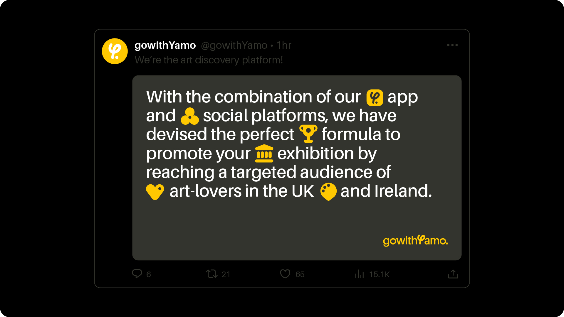
The Art Discovery Platform.
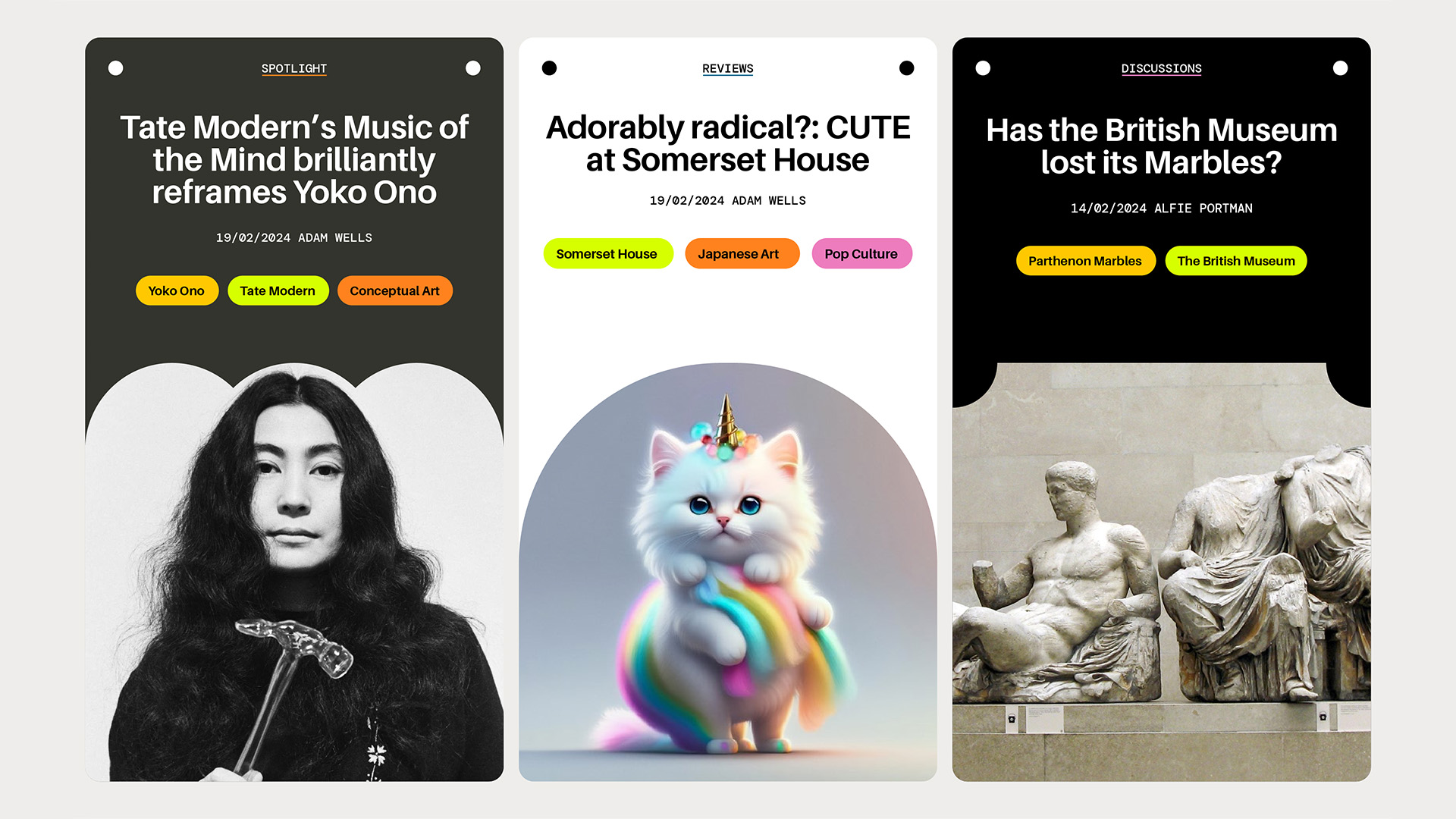
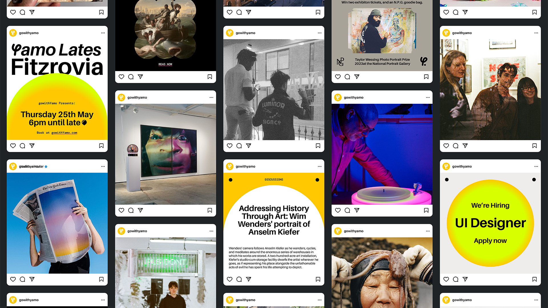
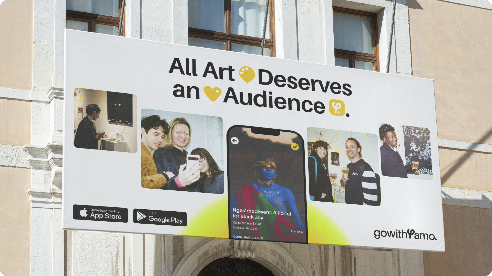
Catering to the curious and creative, gowithYamo’s accessible platform provides access to a dynamic community and facilitates greater opportunity to discover exhibitions and new perspectives.
Expanding on the Pentagram designed identity we wanted to create a system centred around cohesion, clarity and functionality without sacrificing the creative essence at the core of the brand. Starting from the Yamo Path – we developed a brand system that establishes Yamo as a champion of art and facilitator of discovery. However, as a community, we also wanted to create space for Yamo to cohesively promote and express themselves, and feel cool doing it! #Yamolove
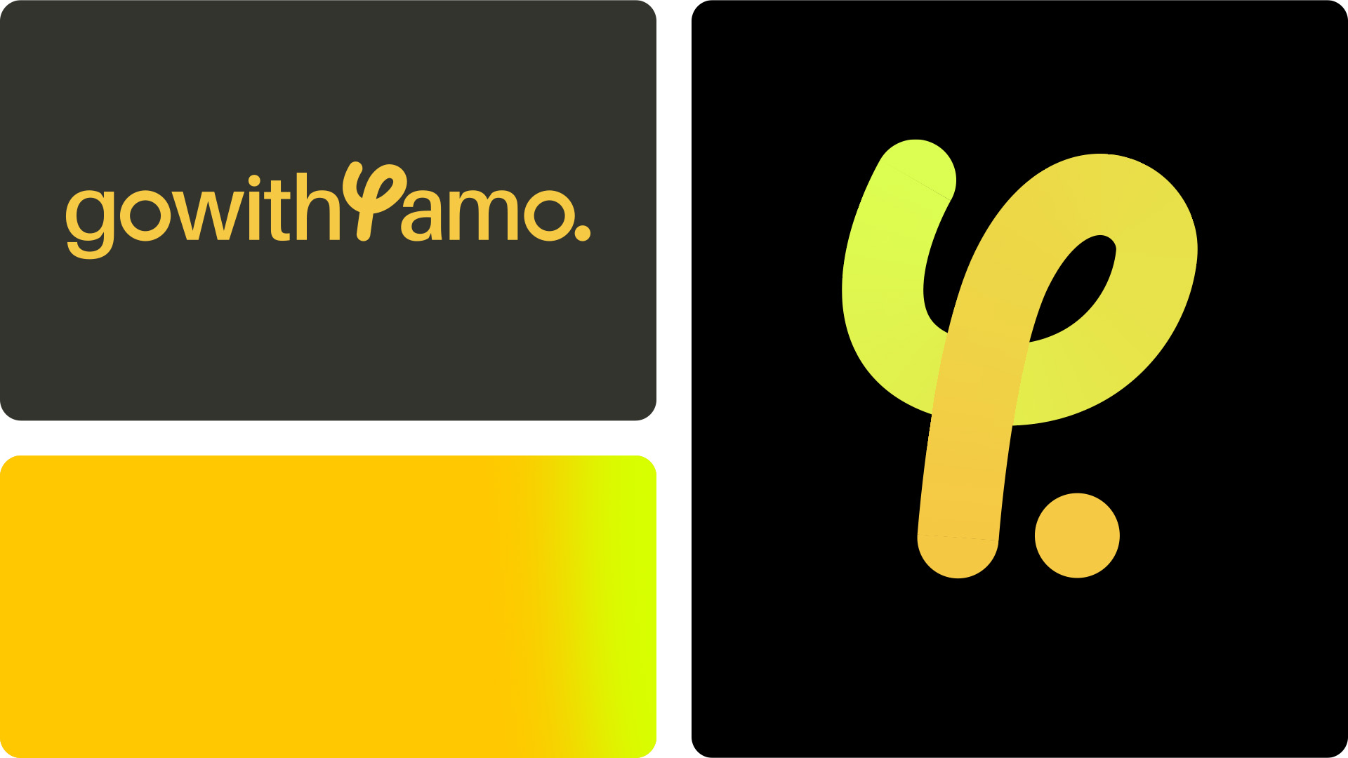
The Yamo Path
The Yamo Path is about the process of discovery, it’s a trail to follow, a pathway and a guide; taking you on an ‘art journey’. It embodies both the physical movement between exhibitions and the greater journey of artistic discovery the platform provides.
With this visual tension of strokes and end points, the overall brand concept always lands on the YamoYellow dot to represent the destination. This stands for the exhibition, the gallery around every corner, the art lovers’ pub crawl, and a curated dot-to-dot. gowithYamo mark the spots, you make the connections!
It also makes a ‘Y’ shape, so that’s pretty convenient too.
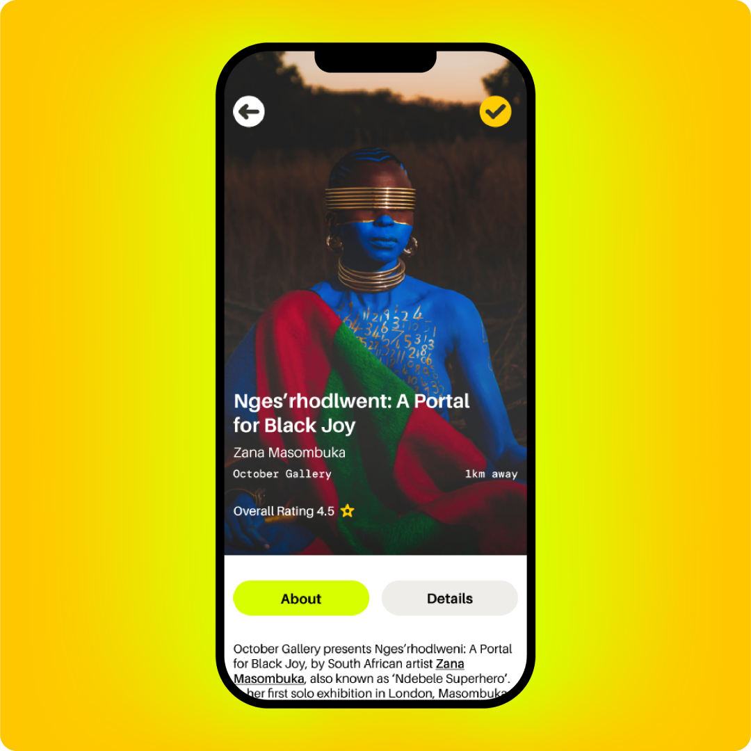

Digital First Community
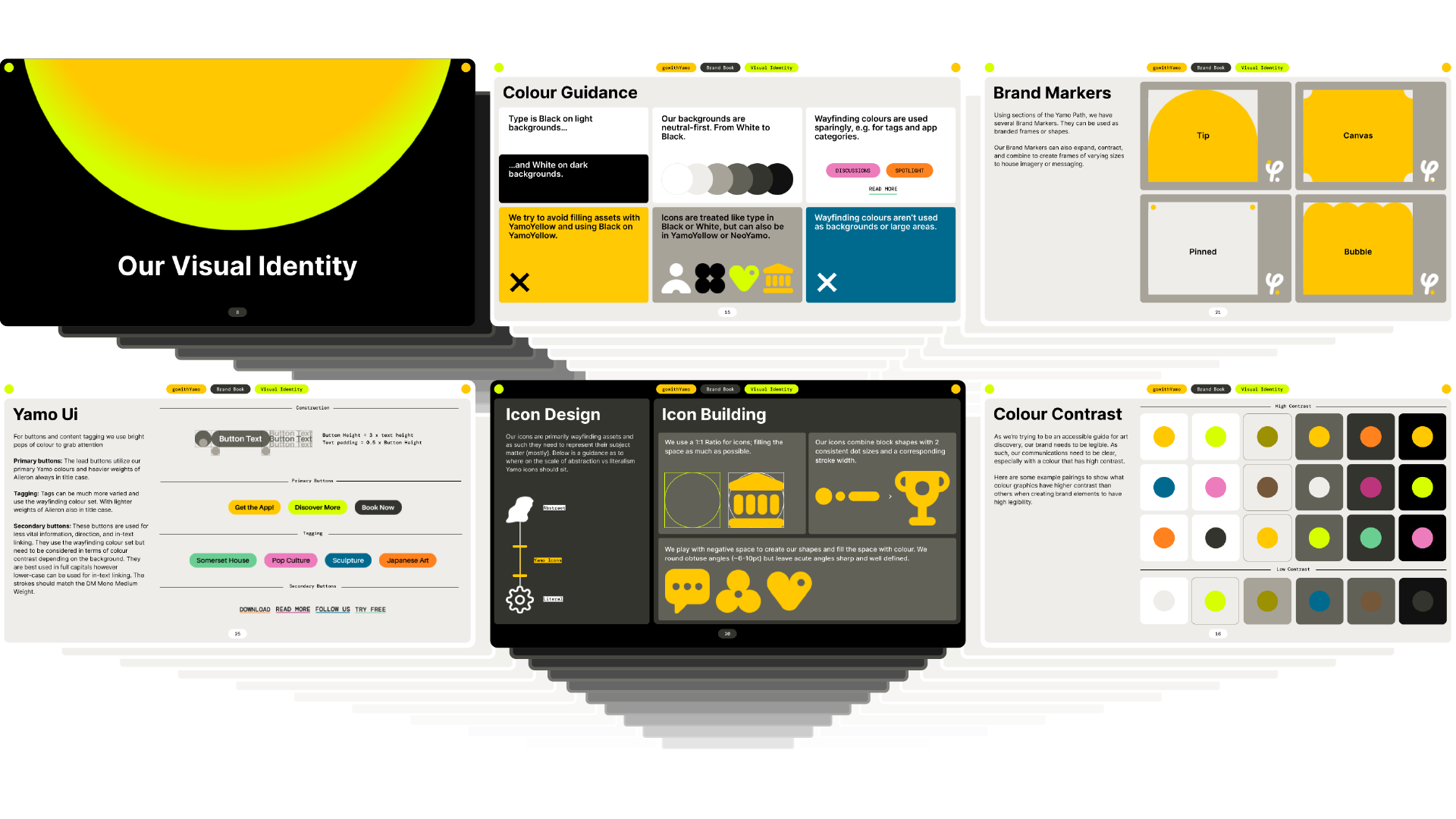
As an established brand we wanted to embrace the recognition around the YamoYellow identifier while also breathing new life into the palette. We worked to reduce and boost the colours, increasing recognition and supporting the digital-first nature of the product. We also injected the fresh NeoYamo into the fold, to pair with a limited gradient selection and category-specific tertiary colours.
Aileron took place as the brand’s primary typeface due to its high legibility and its previous life as airport wayfinding speaks to the continuing discovery and journeys found through Yamo!
Yamo Focussed –
Championing Art
Building from a ‘Clear Glass’ philosophy we knew that as facilitator Yamo needed to take a back seat when promoting the work of artists, partners and collaborators. However a system built around clarity could leave the internal team with a lack of hierarchy and, as is often the case with other curators, a loss of self identity.
For that reason we wanted to give the team a way to flex up and be more expressive with their internal comms when needed. A simple, yet flexible extension on the system gives licence back to the core team allowing for freedom of design that extends the life of the brand. After all, sometimes you just got to back yourself!
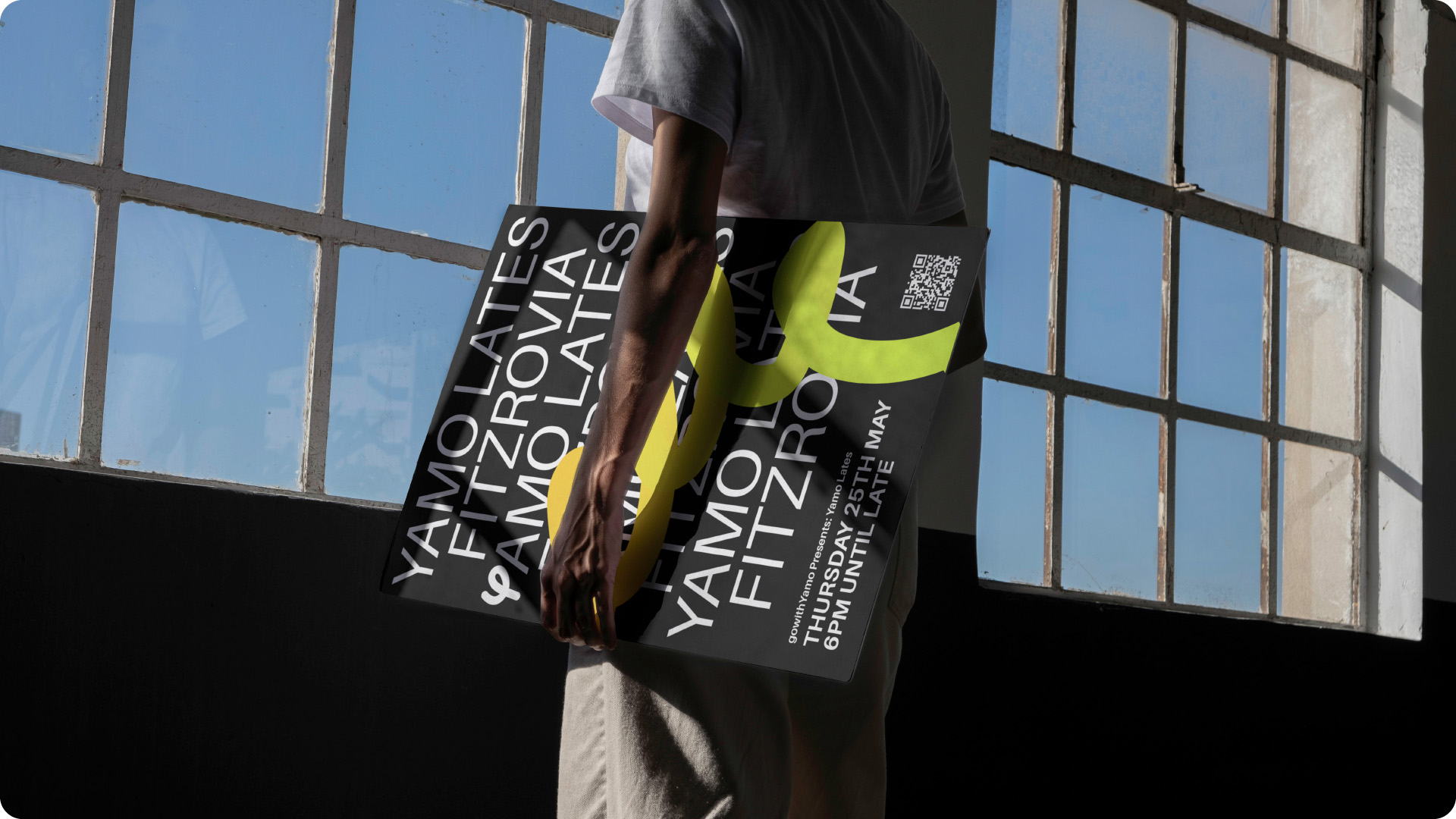
Yamicons
The updated icon set takes cues from other elements of the system, borrowing stroke weight and sharing dots with other masking devices and paths. As a service based app we knew that the icons had to form part of functional communication but creatively they needed a level of artistic abstraction as to not waste a valuable brand touchpoint. The result is an expandable set with clear construction and flexibility of concept.
Brand Book
We worked closely with the internal team, to build a strong foundation behind their visual system and brand concept. Giving them both functional guides for core elements and guidance for brand markers with enough freedom and flex so that the brand can continue to grow as a creative community
With Thanks
To the entire gowithYamo team for having us on board, and inviting us to ensure all art gets it’s audience.


