

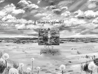
A comprehensive rebrand for a UK based charity, which champions the voices of those affected by dementia.
Working closely with Arts for Dementia, we’ve revitalised the charity, crafting a vibrant brand system that seamlessly unifies online and offline experiences. Beyond a rebrand, it’s a celebration of resilience and community. Through co-production, the design showcases their exceptional services, amplifying the voices of those affected by dementia. This transformation empowers and invites you to join in giving agency to these voices.
Life doesn’t end with a diagnosis
Arts for Dementia envisions everyone affected by early stage dementia finding, enjoying and benefitting from creative activities’. Our rebrand reflects this vision, emphasising possibilities and recognising the agency individuals maintain even after a diagnosis. Life doesn’t end with a diagnosis; it marks the beginning of a new chapter, where Arts for Dementia stands ready to be a guiding light for those who need it.

A guiding light for those who need it
Crafted through co-production, the logomark symbolises Arts for Dementia as a guiding light for those affected by dementia, a distinctive beacon navigating the challenging terrain ahead. It serves as a constant reassurance, signalling the right path and aiming to be a lasting identifier for the charity. Embracing imperfection, the design pays tribute to the reality of life with dementia, inviting others to do the same. Post-diagnosis, life isn’t perfect, but with Arts for Dementia, imperfections are supported, embraced, and shared.


Pictographs
Our strategic findings revealed widespread misunderstanding about the impact of dementia, especially overlooking the stages between diagnosis and the end of a person’s life. Contrary to common belief, individuals living with dementia often retain significant agency for extended periods post-diagnosis, a misconception we were determined to challenge within the brand system.
We conducted creative workshops with the charity, involving individuals living with dementia. Through co-production, we crafted a series of pictograms prompted by questions like ‘What is your favourite activity?’ Our goal was to showcase the vast range of classes and workshop offered by the charity, and above all else, the agency retained by those with early-stage dementia, fostering a higher level of empathy.
These pictograms became a cornerstone across various touchpoints, introducing an ever-expanding toolkit of visual assets co-produced by the very individuals Arts for Dementia aims to assist.


Accessibility
A priority for Arts for Dementia was to create an accessible system for the intended audience and achieve AA rating across their website. As a result, we carried out an intensive process of research and development in order to achieve this goal. To ensure we were being as accurate as possible, we presented all visual development to a working group made up of people living with dementia, and direct caregivers, which ensured instant user feedback.

Colour
The colour palette was rigorously tested across both web, digital and offline environments. In our research we discovered that not only is blue the worst colour for those with dementia, but that the disease can also cause a level of colour blindness. Something we then factored into the palette development, and how it was used within a system.

Typography
The typeface Figtree was chosen due to its clean yet friendly geometric qualities. For the wordmark, a .5pt incremental stroke is applied to the first 2 characters of each word. This lends itself to the principles of bionic reading, ensuring the highest level of clarity and legibility when used at the various scales it would be needed, and also communicating effectively for other conditions such as Dyslexia.
Along with the typeface additional adjustments were carried out to the wordmark. The first three letterforms of each word were slightly thickened, to help increase the differentiation between the different characters, creating further legibility.
Visual Assets
Due to the nature of how memory, and vision is impacted by dementia, it was vital we didn’t create designs which were overly complex. Overlapping imagery, and type or creating complex layouts which utilised multiple colours was completely out of the question. Consequently, we looked to develop a component, or modular based system, with clear hierarchy and separation between key visuals and copy. This ensured everything had a distinct placement, and could be engaged with individually, without the risk of confusion or visual overload.


Website
Our focus for the website was not only one of accessibility, but also one of vibrancy, hope and enjoyment. Something which isn’t always synonymous with the sector. We want to revitalise the website, and bring it back to the charity’s ambition of supporting life after diagnosis.
We maintained a strong presence of accessibility throughout. Streamlining the user experience, ensuring type sizes, colour contrast and image usage all conformed to AA and even AAA accessibility standards. We also implemented Alt-Tagging across the website, and implemented a mouse, or pointed device free navigation system. Allowing anyone with a mobility based disability could still navigate the platform, and assured that the charity’s first point of contact for many of their audiences was an enjoyable one.


Language was also a vital part to the website’s design. Generic phrases such as ‘Get in Touch’ aren’t objective or clear enough when you have a condition such as dementia. Consequently we made sure every touchpoint on the site had clear signposting, was a recognisable link, or communicated in the simplest way possible, rather than utilising an abstracted mark such as an icon.
We also utilised a component based web system. Similar to the visual language, this created a clear structure of all assets and imagery which appear across the website, ensuring no issues were caused for anyone with site, or colour deficiencies.

Arts for Dementia do not have an internal design team and it was important that they could continue to independently develop and evolve the branding, once it’s been handed over. As a result, all visual assets from social media templates, to email signatures, deck designs, to the visual toolkit were all accessible via Canva, or the Google workspace, helping to streamline the charities marketing efforts and maximise their access to the new system.
With Thanks
To the entire Arts for Dementia team and Trustees, our stellar copywriter Hannah, and our amazing developer Jake. Special gratitude to all the individuals directly affected by Dementia who generously shared their time with us; without them, this project wouldn’t be possible.