


Building a global community
The Designers League is an 18,000 member online creative community which aims to act as a platform for people to acquire knowledge, receive feedback on their work and gain insight into the current zeitgeist of the industry. A rebrand was required to the platform to be taken more seriously on the global state and appeal to a wider audience.
Concept
The concept behind the rebrand was to create something that was both dynamic, visually appealing but also stayed true to the brand’s tone of voice, and core ethos. That being one of Community, Play and Education. It also needed to be developed across print, digital & motion and have social media at the forefront of the design as that’s currently where the core user base is situated.
Solution
We developed the new TDL mark to be formed of basic shapes and colours. It was designed to be a spin on what we perceive to be craft. Basic geometric forms are a starting point for many designers work, be it UI screen, logos, typography, or illustrations. The simplicity also allowed for the logotype to be easily adapted for motion design and digital while being able to be broken apart to develop patterns.
Services
Branding
Strategy
Positioning
Print
Illustration

Logotype
We developed the new TDL mark to be formed of basic shapes and colours. It was designed to be a spin on what we perceive to be craft. Basic geometric forms are a starting point for many designers work, be it UI screen, logos, typography, or illustrations.
They are evident in nearly all the work we see. I also developed two animated logo stings and a slate designed to sit at the start of a vlog. Video is fast becoming a powerhouse medium within the world, and we decided very early on to approach the rebrand with video in mind.


Colour
The use of colour was important as we wanted something that stood out no matter where you saw it, regardless of medium or device and could be recognised easily.
However, it was also important we chose a scheme which was also fun. Allowing ourselves a larger palette better represented our dynamic community and in turn made our content much more attractive, varied and eye-catching.


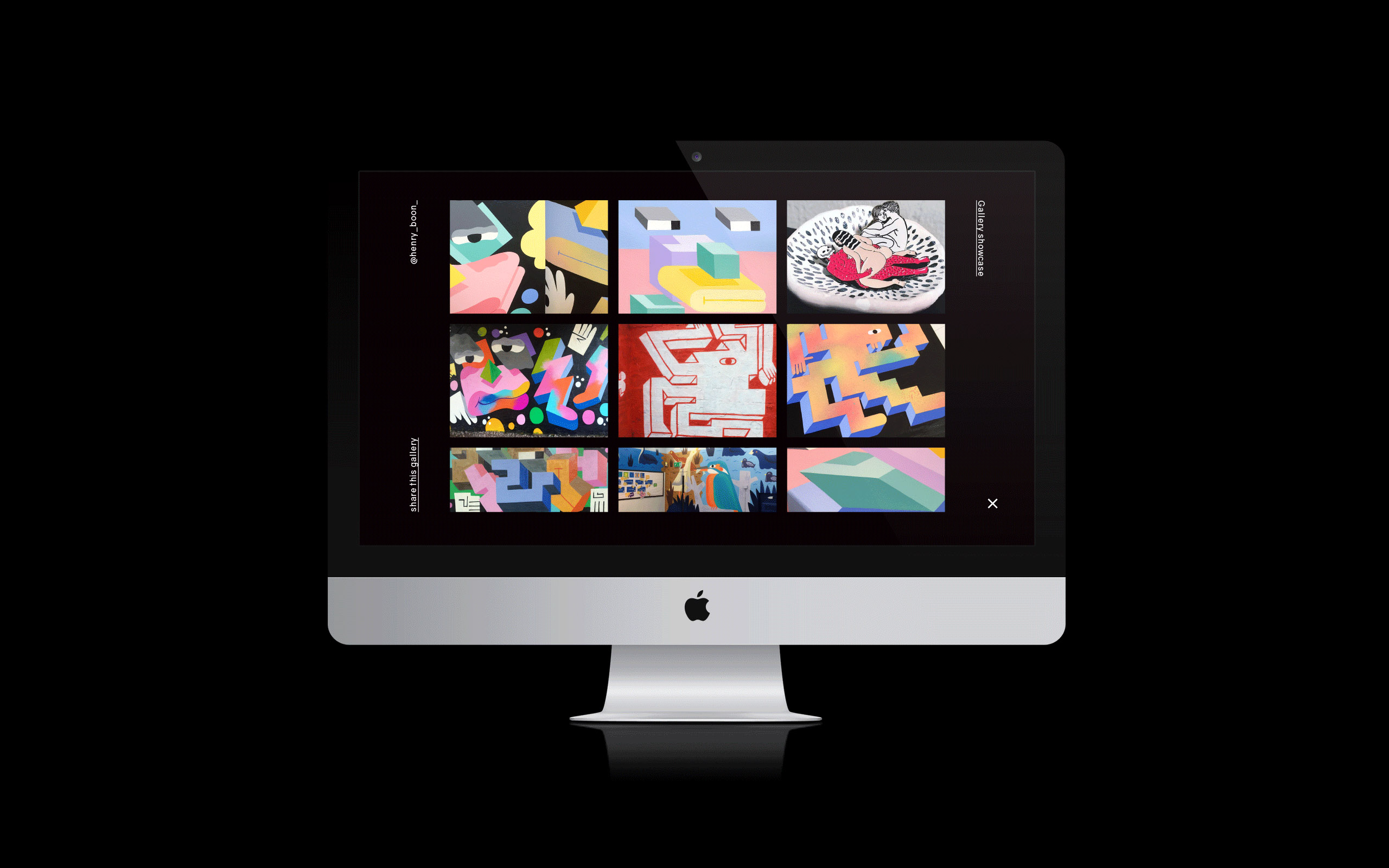
Illustrations
We worked hard at developing an illustration style which was both narrative driven, emotive, could utilise our colour palette and at the same time being playful enough it didn’t feel alienated by the other aspects of the brand.
For me, the illustrations needed to try to remain character-focused and showcase various relatable aspects and choices that come with being creative. It’s not just about making something look pretty, it was equally about proposing questions and scenarios that felt inviting and interesting.

The copywriting used on printed, and digital collateral was a crucial factor. I needed to come across as talking with people, not at them and the language had to be relatable and inviting. TDL is a friendly community where people are free to be themselves, share their work and
experiment. It was founded and continues to be maintained by professional creatives. We’ve all had the same issues and struggles and this is what we wanted to show and uphold as a brand.

