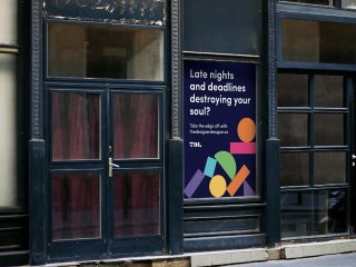
Shining The Spotlight On New Creatives
Cura-Tour has been the collaborative project of British creatives Ben Mottershead and Chris Edwards. It provides a platform for creatives to link up, network and collaborate.
Concept
We were both very aware of the pressures and expectations young creatives, especially students, place onto themselves and after talking we decided that a platform aimed at this demographic, where people talk about their experiences, backgrounds, advice and creative spaces (a tour of their creative environment so to speak) may allow others to realise that they’re not alone in their own struggles and insecurities and it’s natural to feel this way.
Solution
Cura-Tour provides a platform for creatives to link up, network and collaborate. Amidst the creative chasm, a bi-weekly zine capturing interviews with a variety of artists across the creative spectrum plays a major part in the Cura-Tour brand, delivering fresh inspiration from students and graduates across the globe. The project consists of a 2 part zine, showcasing two different artists, a bespoke masthead and logotype created using a custom-designed typeface & also website design.
Services
Branding
Print Design
Animation


Logotype & Masthead
When creating the Initial logotype we wanted something that had a natural shape to it, but also something that would work when stacked in a 3×3 grid system and other formations. For this reason we decided that a custom designed typeface would allow us the greatest amount of flexibility.


Zine
The zine was the focal element of the project. We went with a 9 column grid system to allow more flexibility in laying out content, it was important for us to create something which was both aesthetically interesting, but also allowed for engaging content to be displayed. The focus of the zine was the impart information about the featured artists, not just look good on a wall.


Typography
We chose Gravity as our main typeface not only for it’s elegant yet playful appearance, but from what it’s legibility and letterforms have allowed for a clean and accessible typeface reflecting the core values of Cura-Tours brand ethos.
Reading experience should be fun, and they should be engaging with memorable impact; encouraging the reader to want to carry on. To summaries we chose gravity because of its purpose and function.


