Staying Out The Bin
Most of us can probably agree that 90% of post only stays in your hand for the short walk from the letterbox to the bin, and on the off chance, it hangs about it’s rarely for long. So when Concord came to us to produce their annual client mail out, we wanted to create an object of desire; with enough value and impact to keep it out of the recycling.
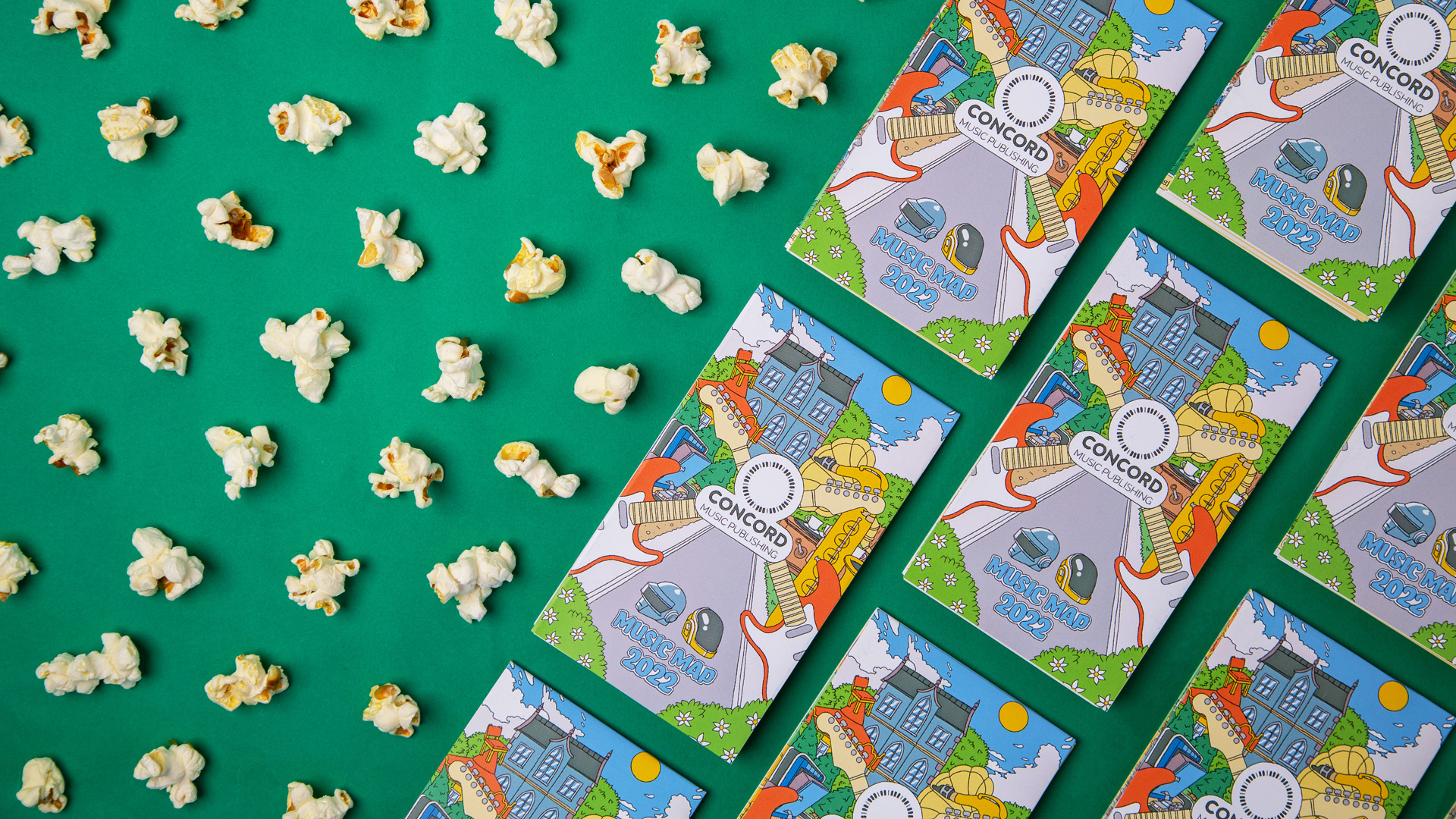
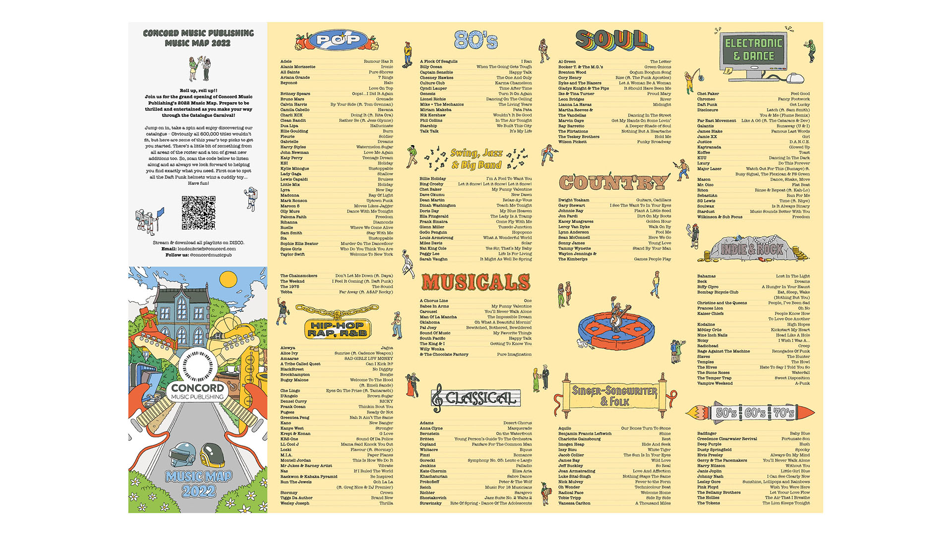
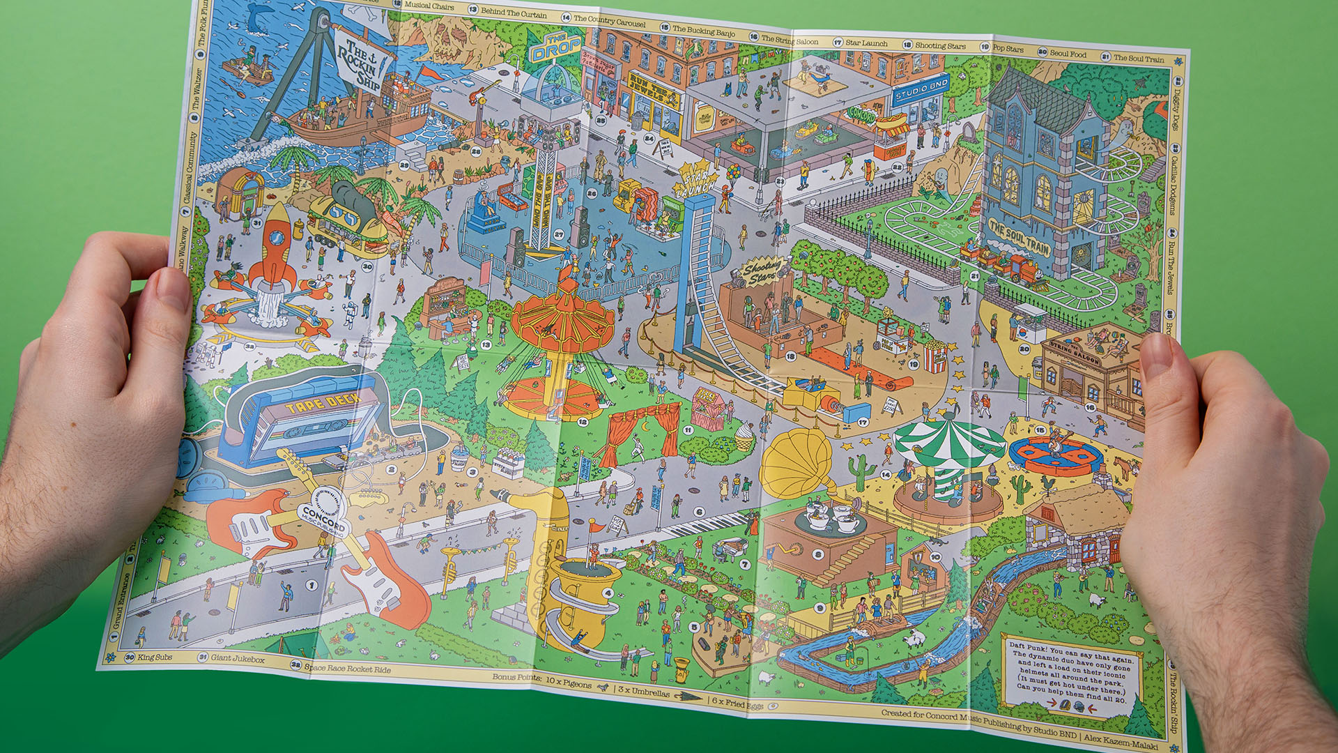
The Music Map is an A3 folded print that encourages people to slow down and engage with the Concord catalogue off-screen. Featuring; a bespoke illustration packed with details and hidden easter eggs. We worked with Concord to develop a design full of personality while elevating their brand tone-of-voice. Adding humour and beauty to an everyday experience makes it memorable. In this case, it gives Concord’s B2B clients another reason to connect to the 250 featured tracks.
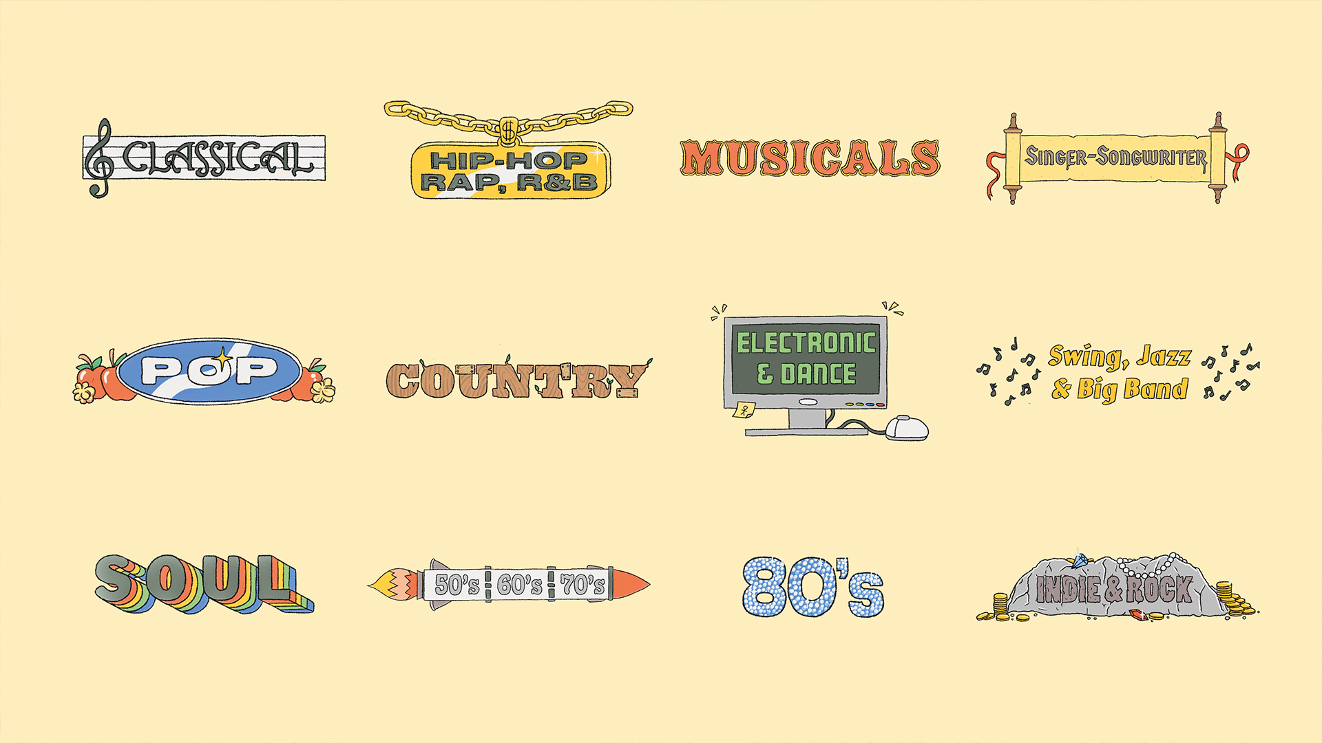
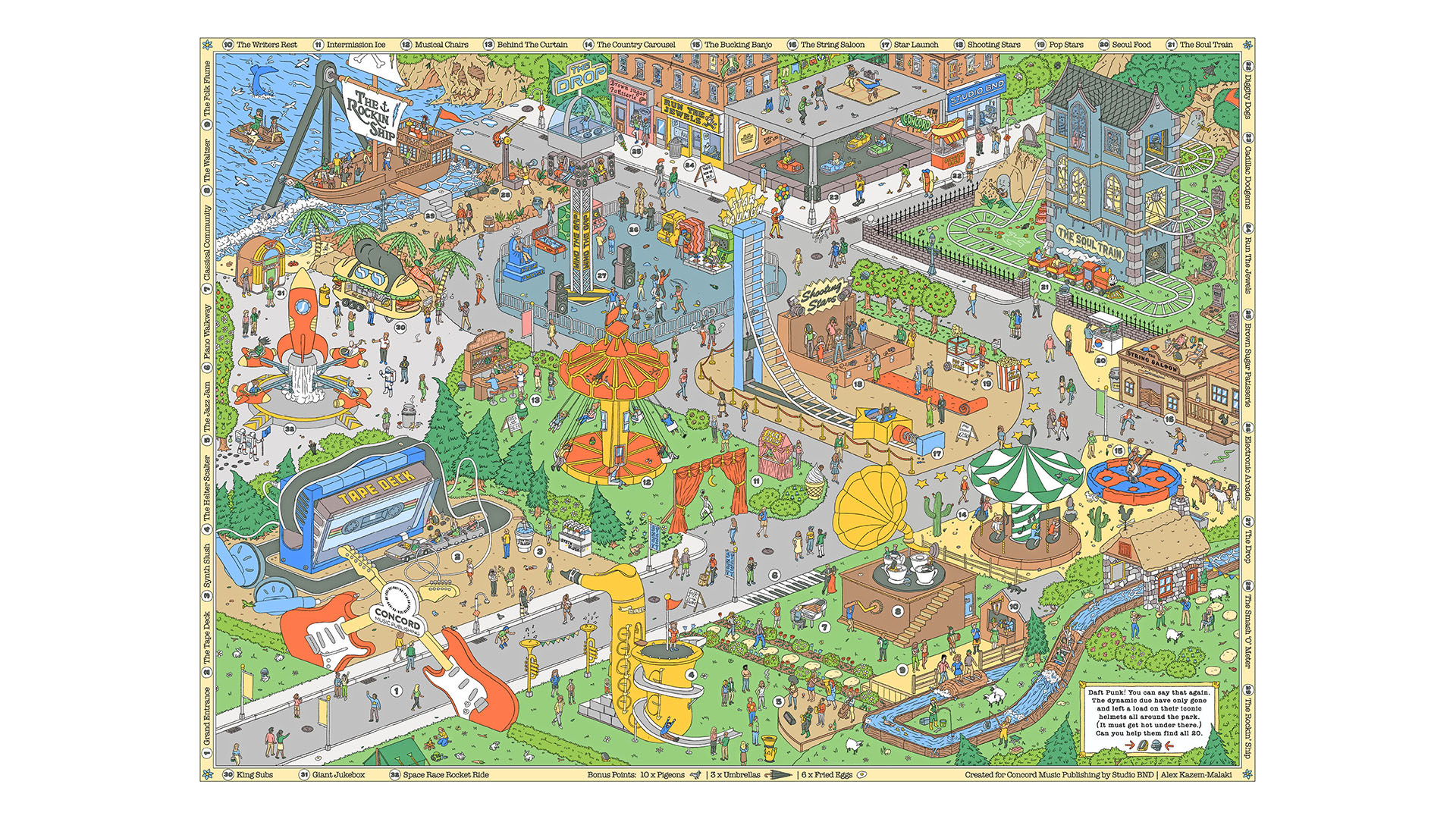
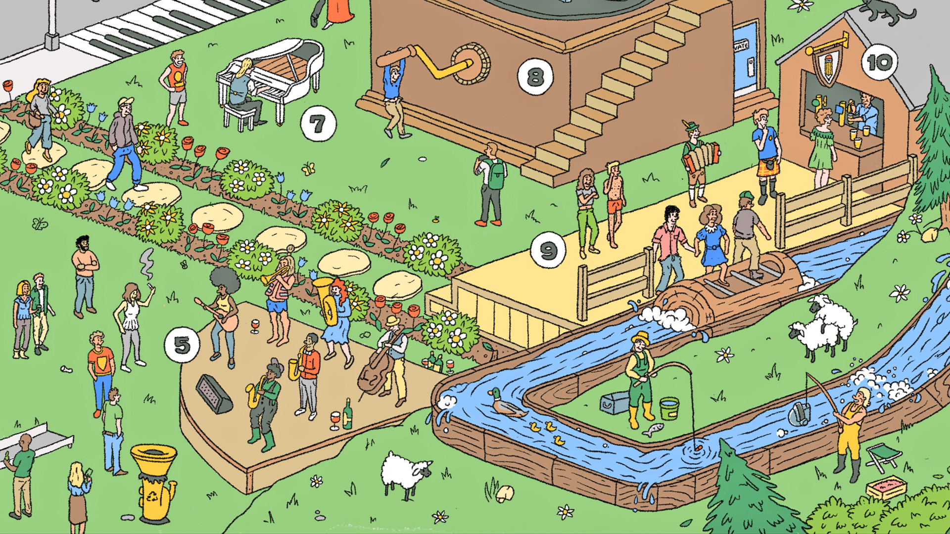
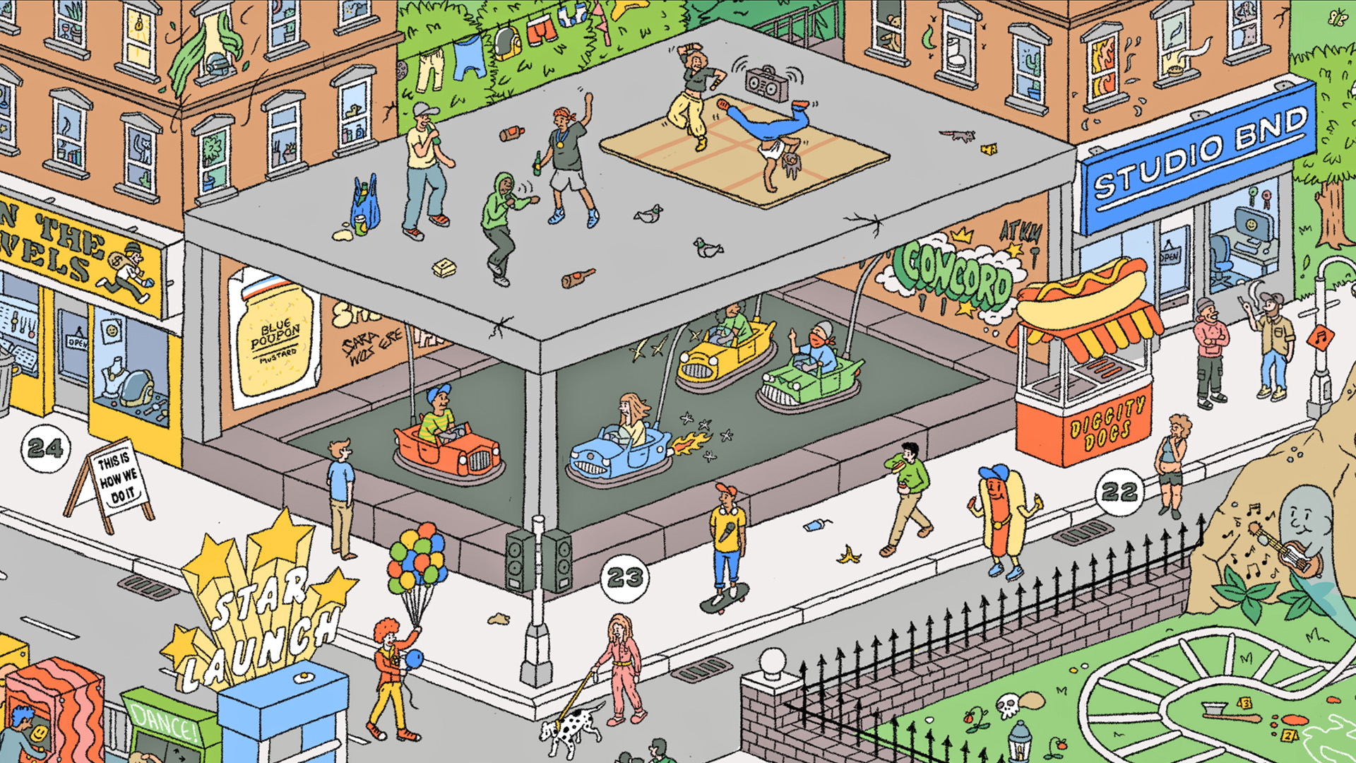
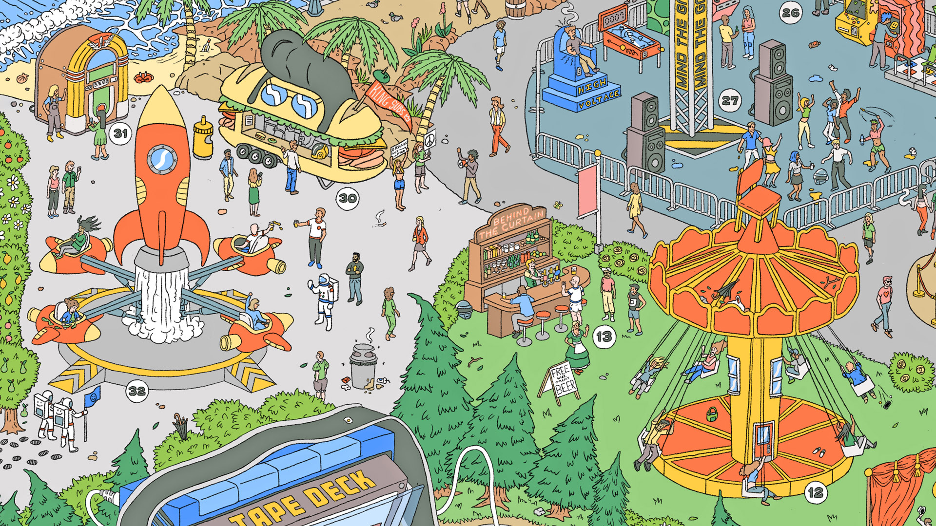
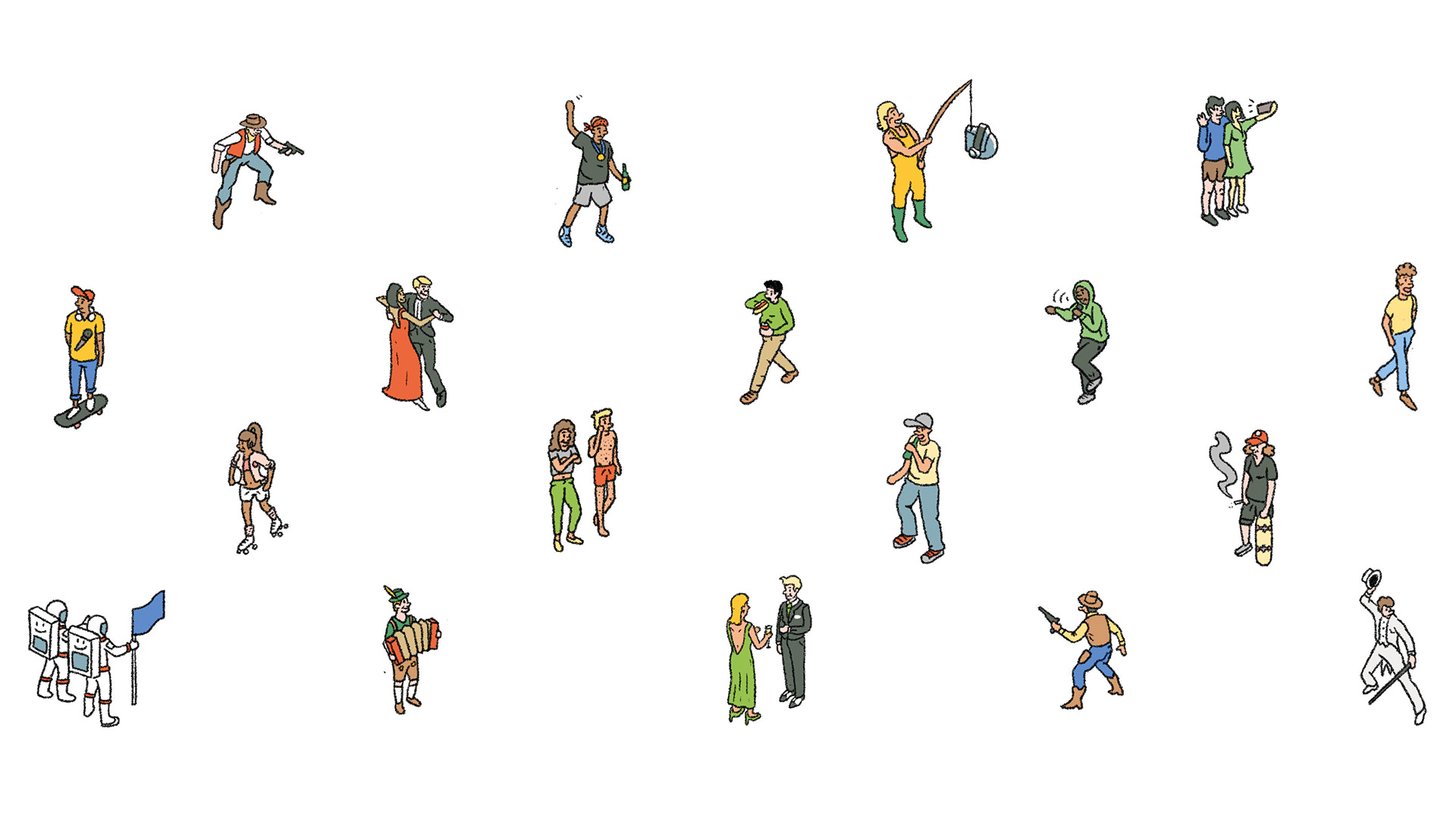
Starting from the idea of a theme park we wanted to create an area highlighting each of the 12 music genres and break these down into different rides and stands to represent the culture and people within them. From ‘The Bucking Banjo’ to ‘The Rockin’ Ship’ the illustration hosts over 30 attractions, populated with more than 250 characters. Combined with all the different find and seek elements from umbrellas, to Daft Punk helmets, this creates an engaging visual feast to get stuck into.


Staying Out The Bin
Most of us can probably agree that 90% of post only stays in your hand for the short walk from the letterbox to the bin, and on the off chance, it hangs about it’s rarely for long. So when Concord came to us to produce their annual client mail out, we wanted to create an object of desire; with enough value and impact to keep it out of the recycling.

The Music Map is an A3 folded print that encourages people to slow down and engage with the Concord catalogue off-screen. Featuring; a bespoke illustration packed with details and hidden easter eggs. We worked with Concord to develop a design full of personality while elevating their brand tone-of-voice. Adding humour and beauty to an everyday experience makes it memorable. In this case, it gives Concord’s B2B clients another reason to connect to the 250 featured tracks.
Starting from the idea of a theme park we wanted to create an area highlighting each of the 12 music genres and break these down into different rides and stands to represent the culture and people within them. From ‘The Bucking Banjo’ to ‘The Rockin’ Ship’ the illustration hosts over 30 attractions, populated with more than 250 characters. Combined with all the different find and seek elements from umbrellas, to Daft Punk helmets, this creates an engaging visual feast to get stuck into.
